Language.
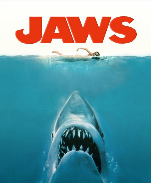
This poster uses little language with the exception of it’s title, Jaws. The poster creates atmosphere and tension by using the picture alone. The title ‘Jaws’ is coloured red which could be seen as representing blood, violence and gore and gives a obvious hint as to the film’s content. This allows a clear insight into what the potential audience can expect and would attract fans of horror and thriller type films.
Institution
‘Jaws’ is a well known and iconic film, originally released in the 70’s. ‘Jaws’ is still well known throughout the different age generations. Both young and old can recognise the well known music used throughout the film to represent the sharks forthcoming attack. Jaws is directed by Steven Spielberg who is one of the most well known and instantly recognisable names within the film industry.
Representation
The poster represents a shark attack however, the victim is clearly unaware of her pending fate. The sharks teeth are clearly visible which suggests what is about to happen to the woman. The shark is also well camouflaged in the water, as the shark and the water are coloured the same, which suggests the element of surprise and makes it more sinister. To ensure that the viewers attention is not drawn away from the main theme of the film the creator has made the poster very minimalistic so it doesn’t distract the viewer and it holds the viewers attention by drawing them in and leaving them with a cliff hanger. Therefore, the viewer wants to know what happens next which encourages them to buy a ticket and watch the film.
Target Audience
The target audience for this film ranges from older teenagers to adults who enjoy horror films. I believe that the film is mainly aimed towards males because the woman depicted in the film poster is naked and could be considered attractive by the male gender. The poster is very clear as to the films content therefore, showing that young children are not the target audience for Jaws.

Hi Liam. Decent start here. This is one of the most iconic posters ever and it’s beautifully simple and elegant. The audience’s eyes are drawn to the red title, but the shark’s head also acts as an arrow to point the audience to the woman, who will end up dead!
Consider representation in more depth next time–there isn’t a lot you could say on this poster, but you could have written about the innocence and helplessness of women, the danger of the sea or the unknown.
Good start though.